

1
Choose a dataset
Pick Sessions, Atom Offer Sessions, or Offer Performance. This determines which metrics and dimensions are available — see Key Metrics & Dimensions for the full list.
2
Select metrics
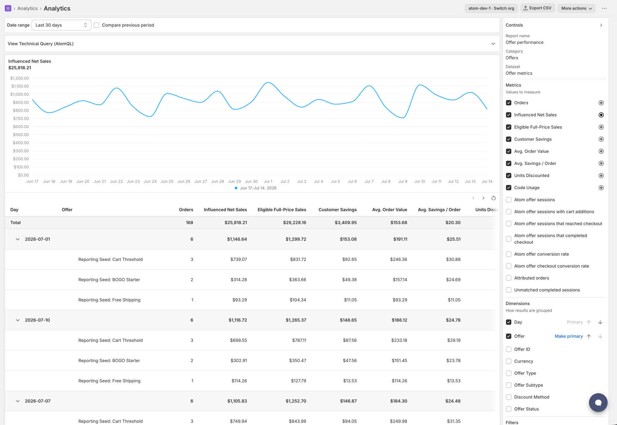
Check one or more metrics from the list. The metric marked as primary drives the headline number at the top of the results and the default chart — select a different metric’s radio icon to change which one is primary.
3
Add dimensions (optional)
Check a dimension to group your metrics by it, for example Day for a trend line or Offer to compare offers. Add more than one dimension to build a nested breakdown, and reorder them with the up and down arrows — order matters, since the first dimension is primary and drives the chart and table grouping, with the rest nested underneath it.
4
Add filters (optional)
Click Add filter, then choose a field, operator, and value.Available operators are Equals, Contains, Is any of, Is all of, Is empty, and Is not empty. Is all of is only available when filtering Atom Offer Sessions by offer.
5
Pick a visualization
Choose Recommended, Line, Bar, Horizontal bar, Funnel, or Table.Recommended picks automatically: a line chart when you’re grouping by Day, a horizontal bar chart for other dimensions, or a table when there’s no dimension selected.Choosing Funnel adds a Funnel mode option — Open funnel or Closed funnel — available only on the Sessions dataset.
6
Set the table layout (optional)
Choose Auto, Flat, or Nested for the data table below the chart. Nested only applies when you’ve selected more than one dimension.
7
Set the date range
Above the results, choose Last 7 days, Last 30 days, Last 90 days, or a custom start and end date. Check Compare previous period to see how each metric changed against the prior equivalent period.If you change the date range on a saved Custom report, a Set as default button appears — click it to make that range the report’s default the next time you open it.